

1UP USA
1Up came to us with a product eduction issue. They needed a way to educate their users about their different mounts without overwhelming them with technical jargin.
Want to see more of my process? Click the button below then click 'Continue as Guest' in the upper right hand corner to see all of my research!
A few of our Ideation Challenges

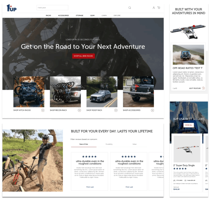
HOME PAGE
Their old site was very technical and straight forward, we wanted to bring the fun of the lifestyle to the brand while leading them towards a purchase.
• We created a way finding banner to help users quickly jump to the rack that best suits their car needs.
• Through research, we found the large majority of users were led to purchase 1UP due to peer references, so we decided to utilize this a lot through the site in different forms of reviews.
• we broke down their technical features and instead, rephrased them as benefits for the the end-user.

CATEGORY PAGE
There biggest issue here was that all the racks look the same at first glance.
• We designed product cards that helped users determine the differences without having to click into the product pages
• Along with brief descriptions, we also provide the number of bikes and how much weight each rack can hold.
• Since this is also a high entry point for users, we made sure there was general education around the brand and what sets it apart from other bike racks
PRODUCT PAGE
While this is the place that houses technical information the user might need we carefully designed it to not be overwhelming and more of a guided experience.
• We suggested adding buy no pay later apps to help off set the cost to reach a different demographic of users
• We made sure to lead with the benefits and then describe the technical information associated with that benefit
• We made sure all the end users questions were answered so they didnt bounce do to lack of information. we included things like installation instructions, potential add ons, FAQs, car compatibility etc...

OTHER PROJECTS


